Business Premast Most Trending presentation
New year – Best decks of the year
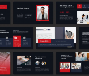
The Minimalist Win
Sarah stood before the investors, palms sweating, but her slides were an anchor of calm white space.
She clicked to the revenue slide, where a single bold number told the whole story without a single bullet point.
The room went quiet, not out of confusion, but because the data was undeniable and the design was effortless.
That minimalist template didn’t just hold her charts; it held the room’s attention when it mattered most.
It was the most downloaded deck of the year for a reason: it turned complicated chaos into a funded dream.
The Efficiency Shift
It was 11 PM on a Tuesday when the client suddenly asked for a LinkedIn version of the quarterly strategy.
Last year, that request would have meant another pot of coffee and a frantic redesign until sunrise.
But this time, Marcus just smiled, opened the “Multi-Format” master deck, and exported the square layout.
What used to take hours of formatting was finished before the kettle even had a chance to boil.
Efficiency defined 2025, and this adaptive template proved that smart design buys you back your time.
The Aesthetic Pivot
The boardroom was expecting another cold, blue corporate presentation full of lifeless stock photos.
Instead, the screen lit up with warm earth tones and editorial photography that felt like a conversation.
The mood shifted instantly, transforming a rigid sales pitch into an inviting journey through the property.
By trading safe choices for genuine style, the presentation stopped feeling like a lecture and started feeling like home.
This aesthetic shift wasn’t just a trend; it was the year we finally let emotion back into the meeting room.
The Dark Mode Takeover
The data was complex, a tangle of user metrics and growth spikes that looked messy on a white background.
Then they switched to Dark Mode, and the neon green charts popped against the charcoal like city lights.
Suddenly, the confusing trends became clear visual victories that even the non-technical stakeholders understood.
It wasn’t just about looking cool; it was about reducing eye strain and increasing clarity in a high-stakes review.
The “Dark Mode” deck won the year because it turned raw, boring analytics into a cinematic experience.
related Posts
-

Public Speaking Tips
How to Get Ready for a Speech in ... -

Technology Empowers You to Optimize Your Time.
Year after year, our dependence on technology grows ... -
Top 10 Presentation Styles: Which is Best for You?
Preparing for a presentation involves choosing the right ...
Leave a Reply
You must be logged in to post a comment.
Leave a Reply
You must be logged in to post a comment.