Guides learning presentation
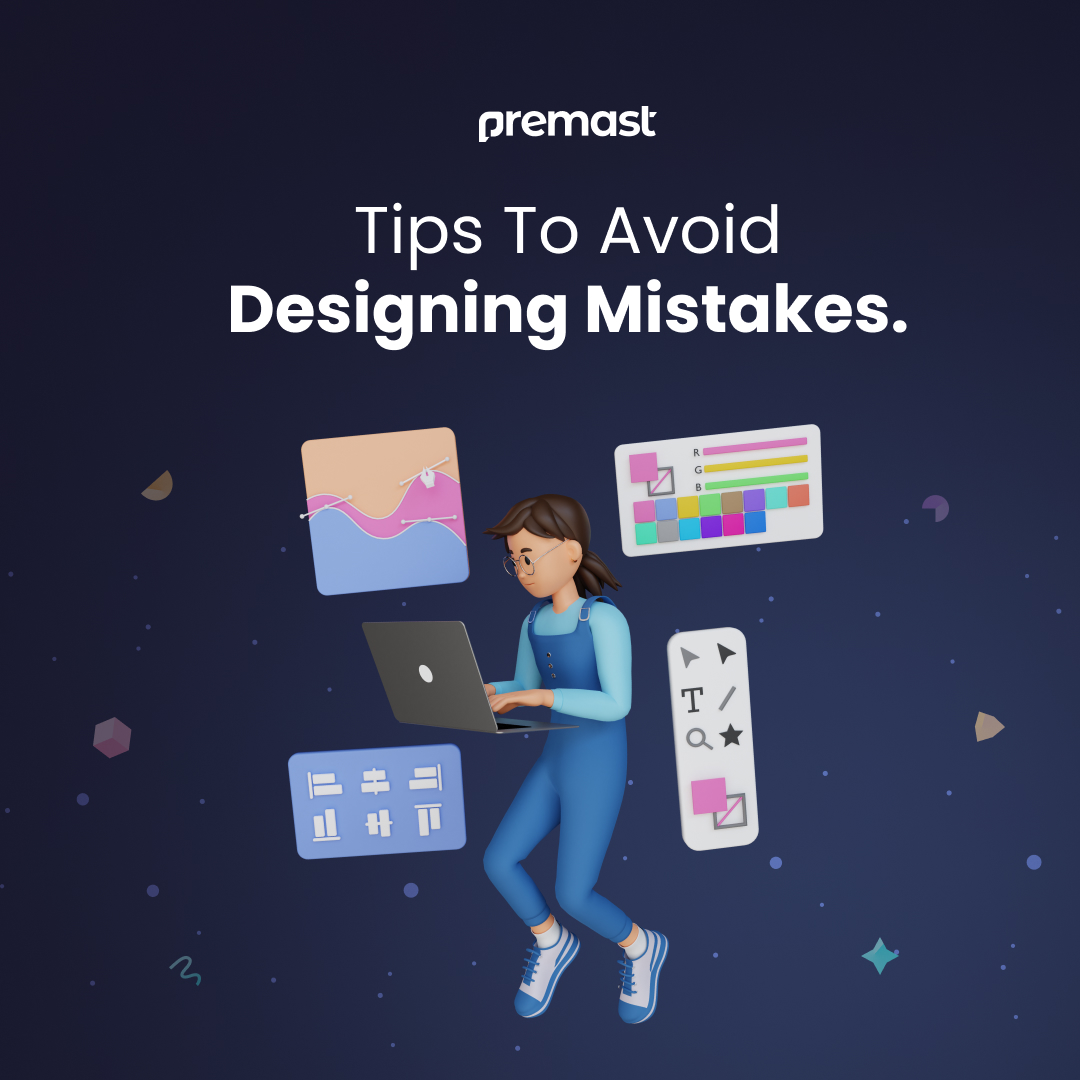
Tips To Avoid Designing Mistakes

Graphic Design can play a crucial role in helping individuals achieve their professional goals and succeed in their chosen field. No matter what kind of business you’re beginning, make sure your brand is unique & essential. This includes having a catchy logo, a website design that stands out and gets noticed, and promotional materials that attract people and leave them wanting to know more.
Common Mistakes to Avoid in Graphic Design:-
In the world of graphic design where competition is tough, your work needs to be unique. That means you shouldn’t settle for average – your creations should be really impressive.
Collaborating with a skilled graphic designer allows your brand’s message to be effectively conveyed while upholding visual appeal. The utilization of graphic design services contributes to the expansion of businesses by delivering top-notch design solutions that are distinctive. Through their imaginative graphical creations, they draw in customers and drive sales transactions.
Customers avoid buying from companies that seem unprofessional or don’t have good visuals. To make your business’s graphics look impressive and appealing, AVOID:
1-Failing to Get What Your Audience Wants:
When creating various elements like ads, logos, pamphlets, or websites, it’s essential to take the intended audience into account. Neglecting to prioritize the audience during the initial phases of design will likely result in unsuccessful outcomes.
Your company’s graphic designer should be familiar with both your services and your intended design audience. It’s important to ensure that the graphic designer is aware of your target demographic so that they can craft suitable content accordingly.
2-Avoid Using White Space:
Mistakes in graphic design like this are quite common, but fixing them is quite easy. Just increasing the space around the text can make the message come through more clearly. Space means any open area on the page, regardless of its color.
A really important part of good design is contrast. This makes the text easy to read. Blank space, also known as white space, is super important for good design too. To help users concentrate on what you’ve written, make sure your designs have plenty of empty areas.
3-Utilizing ready-made pictures:
You can easily get cheap stock images, but they’re not as personal as making your own. Just because something is simple doesn’t always make it better.
Using stock photos is easy, but they might make your company seem unprofessional. While you put in time and money for good content on every webpage, don’t forget to also spend on good images.
4-Ignoring The Recommended Design Guidelines:
Design is all about clear communication. When things are easy to understand, design principles make that communication even better.
Many times, visual creators ignore the importance of clarity, simplicity, and effectiveness in their work. Your design should be straightforward, ensuring that the viewer easily grasps all the essential information. Minimalist designs avoid unnecessary complexity, as clutter tends to make things more complicated. Opting for the appropriate typeface, color palette, and layout is crucial for optimizing the impact of your work.
5-Using a lot of different fonts:
Selecting the appropriate font plays a pivotal role in the triumph of your project. Nevertheless, employing an abundance of fonts could lead to perplexity. It’s advisable to limit yourself to a maximum of two or three fonts and styles for each piece, for instance, a combination of serif and sans serif fonts.
Changing fonts frequently can make it difficult for readers to understand. Stick to simple, easy-to-read fonts, especially when the message is essential.
6-Ignoring the Latest Trends:
Styles change over time, so it’s essential to stay updated. Research what’s popular before you start designing. Graphic design resources are full of helpful information and ideas for your designs.
However, being trendy isn’t a must for your brand. Trends are just a way to get creative ideas, not a strict playbook to follow. Focus on what has worked well for your brand, and use what’s essential for your brand’s unique identity.
7-Inability to Embrace Efficiency Advancements:
Modern digital tools, like file formats and software, have made designing easier. Some designers still use old methods, which make their work slower and less profitable. The goal is to find a way to simplify work without losing quality or creativity.
Visual designers should capitalize on the latest advancements in machine learning. This enables creative experts to automate aspects of production that were previously beyond their reach. Design tools are undergoing substantial transformations to assist artists in time-saving and stress reduction.
8-Mistaken Implementation of Hierarchy:
The arrangement of elements in graphic design establishes a structure, enabling viewers to recognize the significance of each element and how to engage with them. Hierarchies serve as the optimal method for giving priority to information.
The primary objective when crafting a creative design is typically to engage with the intended viewers. Whether it’s promoting a sale, an event, or a blog post, the way you structure your design elements will dictate the message your audience receives. You can establish this order by employing techniques such as color choices, visual elements, font styles, and strategic placement.
9-Neglecting the Role of the Medium in Design:
Frequently, designers lack a precise understanding of the eventual usage context for their visuals. Their designs may appear impressive, but they might not function optimally on websites or in print, as they weren’t initially crafted for these platforms.
By taking into account the presentation of your design on print, mobile devices, and social media, you can effectively communicate your message.
10- Not Getting Feedback:
Design is subjective, but it’s essential to get feedback from others, especially your target audience. This can help you identify issues you might have missed and improve your design.
By avoiding these common mistakes, you’ll be better equipped to create impactful and visually pleasing designs that effectively convey your message.
Conclusion:
Good graphic design is vital for your business, impacting your reputation. Make sure to team up with a skilled designer to avoid problems. Designers sometimes make basic mistakes in their careers. If you know these mistakes and how to avoid them, you’ll get better results from your designer and save money in the long run.
⛱️ Don’t miss our Summer Sale ⛱️
Use This Promo code “SUMMER25” to save 25% on all plans or Click on Summer Sale.
Leave a Reply
You must be logged in to post a comment.


Leave a Reply
You must be logged in to post a comment.